Famiglia Santoni
Famiglia Santoni had an enviable problem: a delectable line of spirits that disappeared on the shelf. Stranger & Stranger's solution included a mixture of colour, clarity, and well-harnessed patterns.
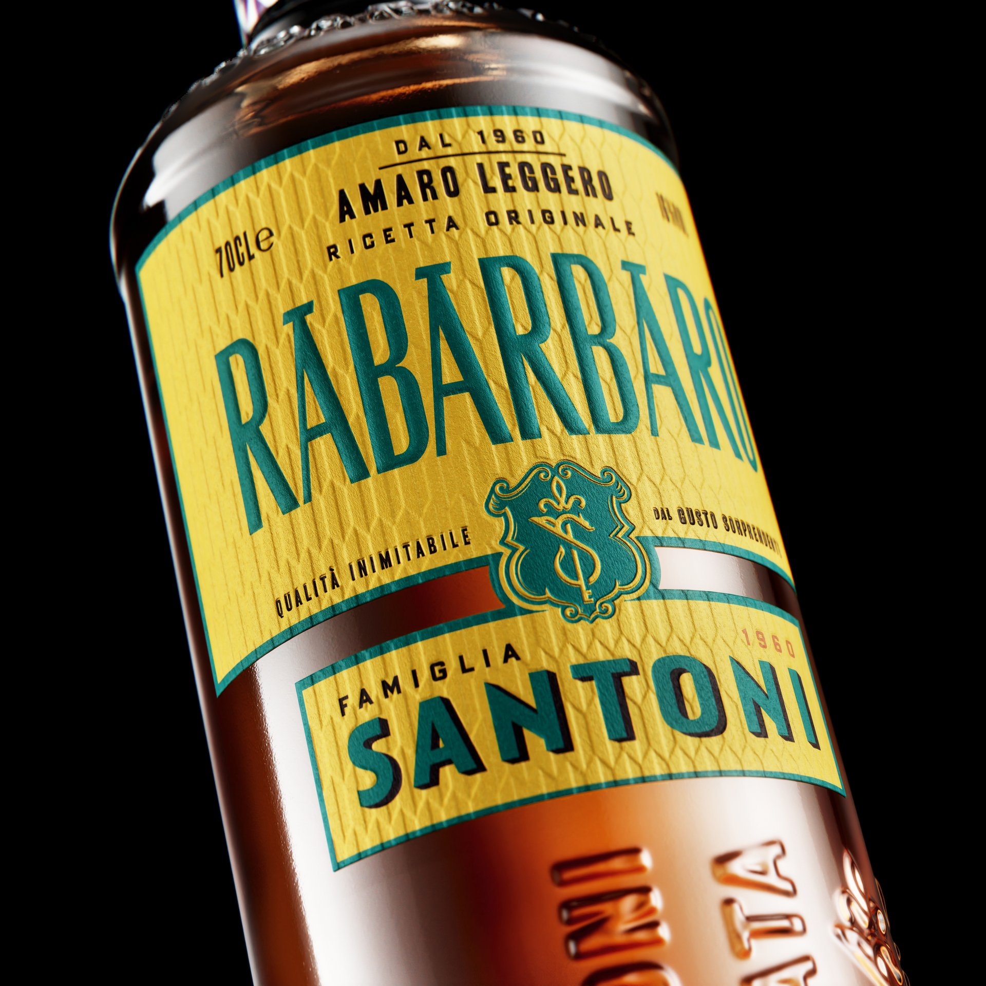
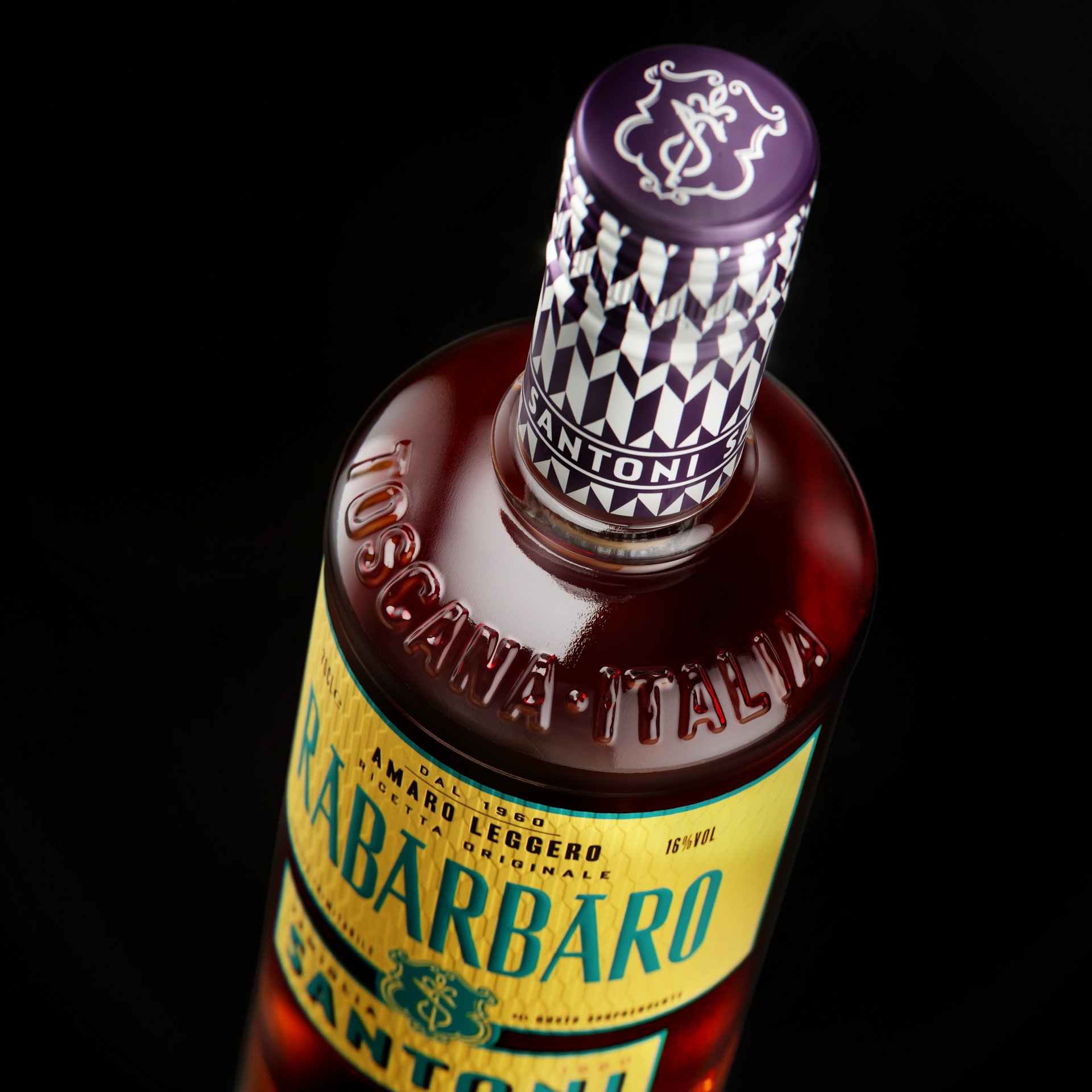
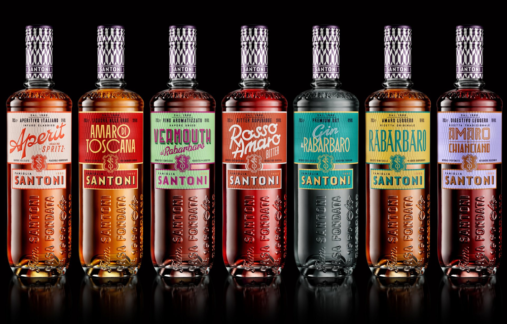
We started with a palette as sun-drenched and inviting as the brand's Tuscan provenance: golden ochre, lemon yellow, fiery terracotta, and deep, rustic red. Armed with a range of hues that would pull the attention of even the most jaded eye, we then incorporated depth and definition, with a lightly-shadowed logo mark and a stylised capsule wrap.
We looked to the patterns of Florentine tilework for inspiration, delivering both modern Italian flair and an ownable visual reference point. These features together create a visual language that extends across the line of spirits. This uniformity both expands and contracts, showing a brand that can command an entire shelf without sacrificing the standalone star-power of each spirit.
A variety of colour treatments and unique typefaces differentiate the individual bottlings, but the overall impression is clear: this is a family of spirits that will last for generations.