
Firehook Brand and Packaging Evolution
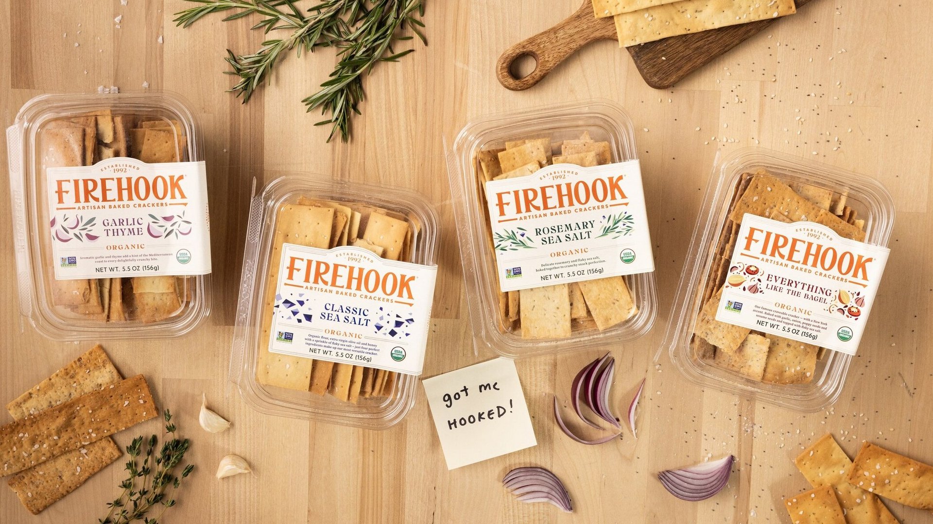
Bringing the sensory satisfaction of a beloved brand’s product to it’s packaging...
Firehook sought to refresh their brand and packaging to create a visually arresting, memorable presence in a ever-so-crowded market.
The solution: Design a brand and package that clearly communicates the Firehook brand, showcasing its artisan crackers, and using colourful modern graphics to elevate the product.
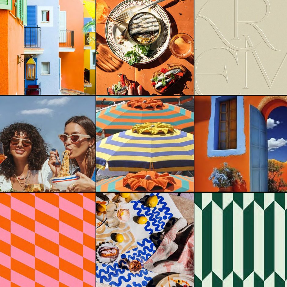
Inspiration
We love a brand with Mediterranean roots and a rich history of artisanal baking. Inspired by the crackers’ clean, simple, and natural aesthetic, we proposed a bright, yet soft color palette and modern illustrations with a classic and timeless feel.
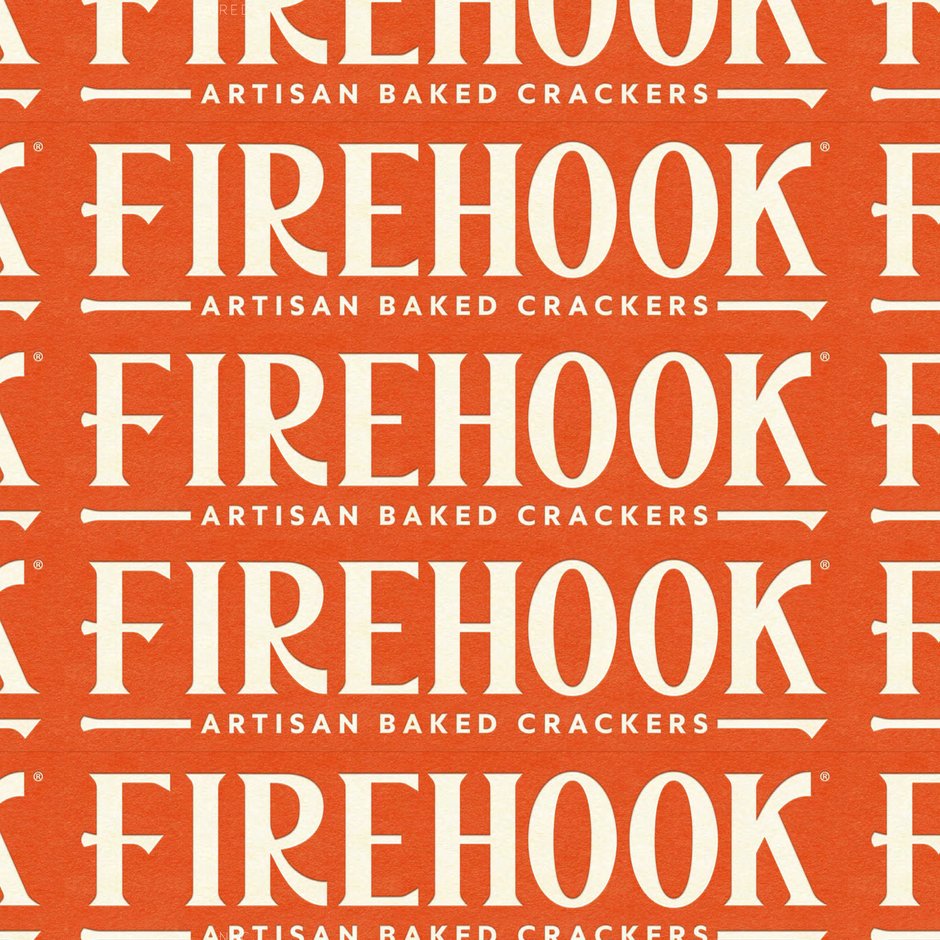
Iconic name + tool
For the logo, we created a modern elevated version of the Firehook tool and a typography style that blends the bakery’s artisan nature with the curves and shapes of it’s namesake tool.
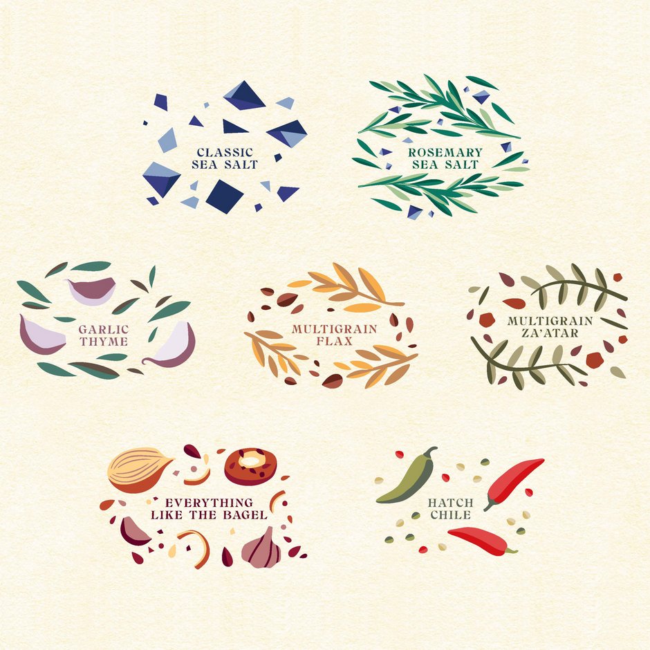
Flavour Differentiation
A major challenge was that the current pack was difficult for consumers to navigate on shelf. People knew the cracker, but did not know the brand. The delightful, soft, and modern visual illustrations of each flavour bring the craveability of the crackers to shelf.
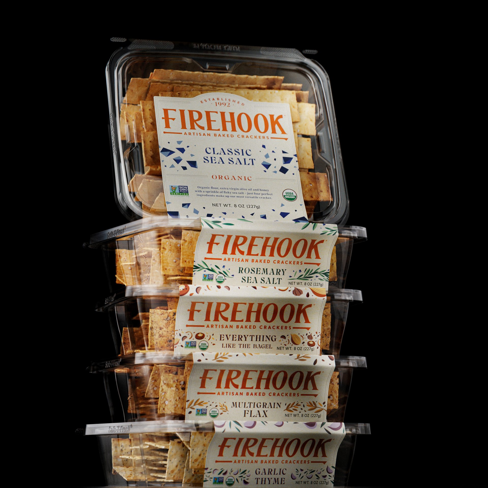
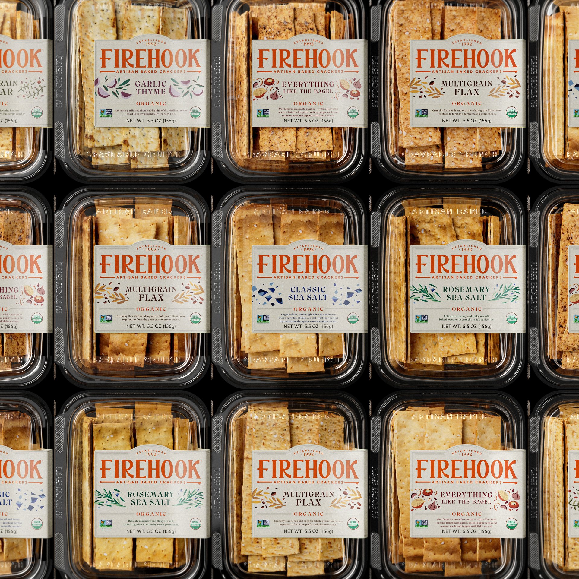
Finished Pack
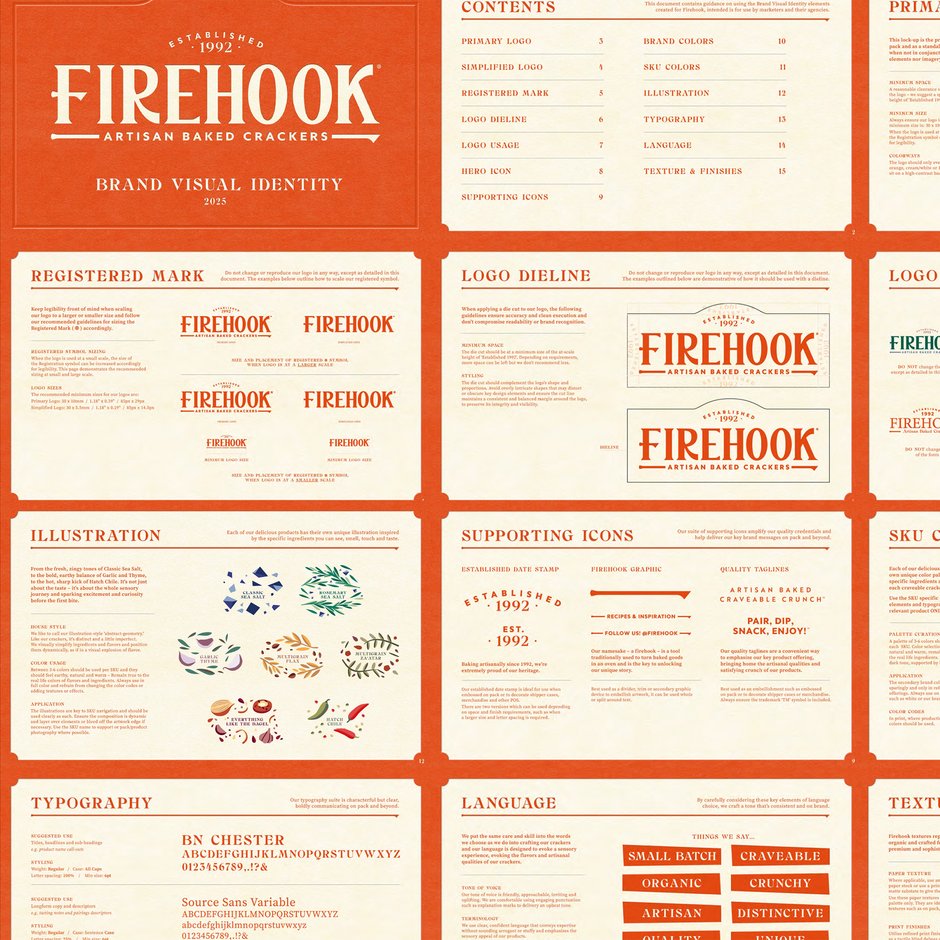
Guidelines
BVI informs look and feel for everything from trade booths to social media posts and website guidelines.
“Stranger & Stranger is an incredible firm that brings vision and excellence to everything they do. Their work has brought new life and new momentum to a beloved brand, and set it on a path to many years of success in the future.”
MATT LEEDS | FORWARD CONSUMERS